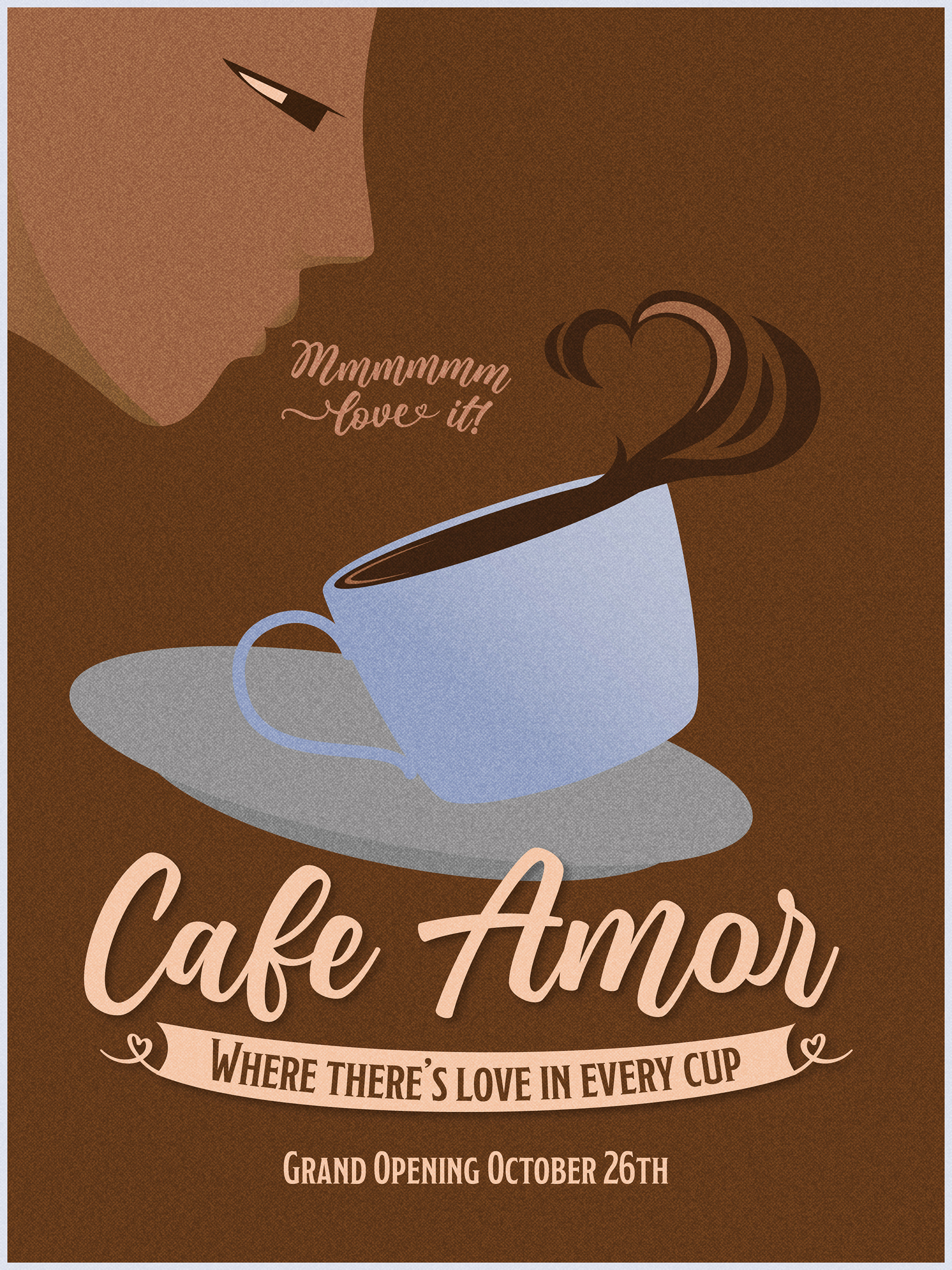
I needed to make a poster for a coffee shop that showed a level of sophistication and gentleness and a feeling of something retro and classic. I drew inspiration from art deco, coffee ads, and the indie scene. Sitting down to work, I decided the name should play into somewhat, since Amor means love, so a love for coffee? Love for their customers? A family-like atmosphere? I went with the motto "love in every cup" to be memorable, and leaning into a trope that is easily recognizable for customers.
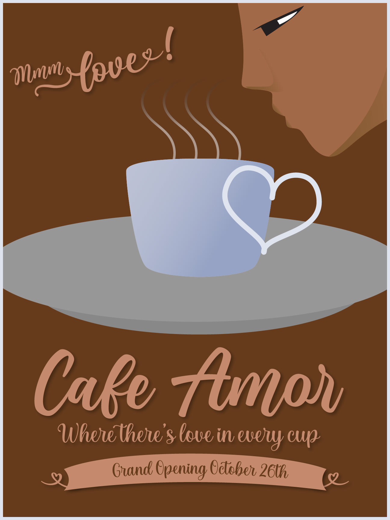
This is the first version I made, and recognized some issues right off the bat. The hierarchy is all over the place, nothing draws the eye through the image, and some of the text is very hard to read. In addition, the attempt to create a link between the handle of the cup and the shape of a heart was dead in the water, as it didn't quite work the way I wanted and I had few ideas how to improve it. Then, I got the idea to make the coffee in the shape of a heart, while adding some motion and shaking things up a bit.
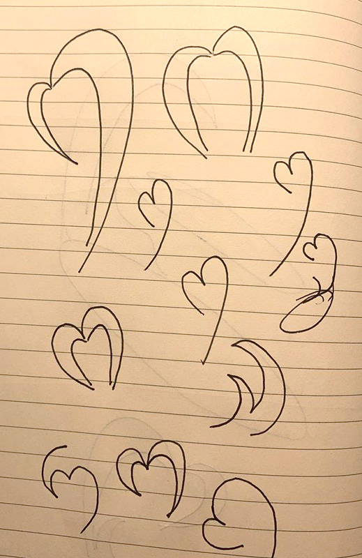
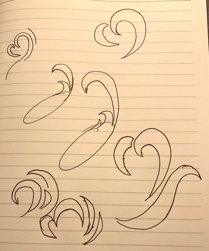
I sketched as I worked, trying to visualize how the heart made of coffee would work. It took some effort but I found an adequate style. I also changed a few colors and angles to create better hierarchy and I feel the final product is much more successful.